Creating a new brand identity for Athletics Canada
 A crucial part of building awareness and attracting talent for any sport is a strong and recognizable brand, which is why Athletics Canada has transformed its image with a new, cutting edge look for athletes and spectators alike.
“Athletics Canada represents athletes from a lot of different disciplines, so we needed to create an identity that represents everyone and unifies them into one powerful team. From high school athletes to national team members, this brand represents all of us,” Athletics Canada’s Chief Executive Officer David Bedford wrote in a press release earlier this year.
“We are thrilled with the work done by One Twenty Three West, pulling inspiration from our sport, our country and our bright future.”
Athletics Canada consists of a variety of disciplines, including track and field, para athletics, road running, race walking, cross country, mountain, ultra and trail. While creating the new brand, they consulted with athletes from these sports — having them review potential designs and provide feedback throughout the process. The video to accompany the brand launch was narrated in English and French by Olympian and 400-metre runner Micha Powell.
“A lot of athletes are hungry and eager to compete after having our seasons cut short in 2020,” said World Championship, Commonwealth and Olympic medallist Aaron Brown in the press release. “This new Athletics Canada rebrand reflects that, letting the world know that the team is ready to come out of the gate with fire and pride when representing the Maple Leaf.”
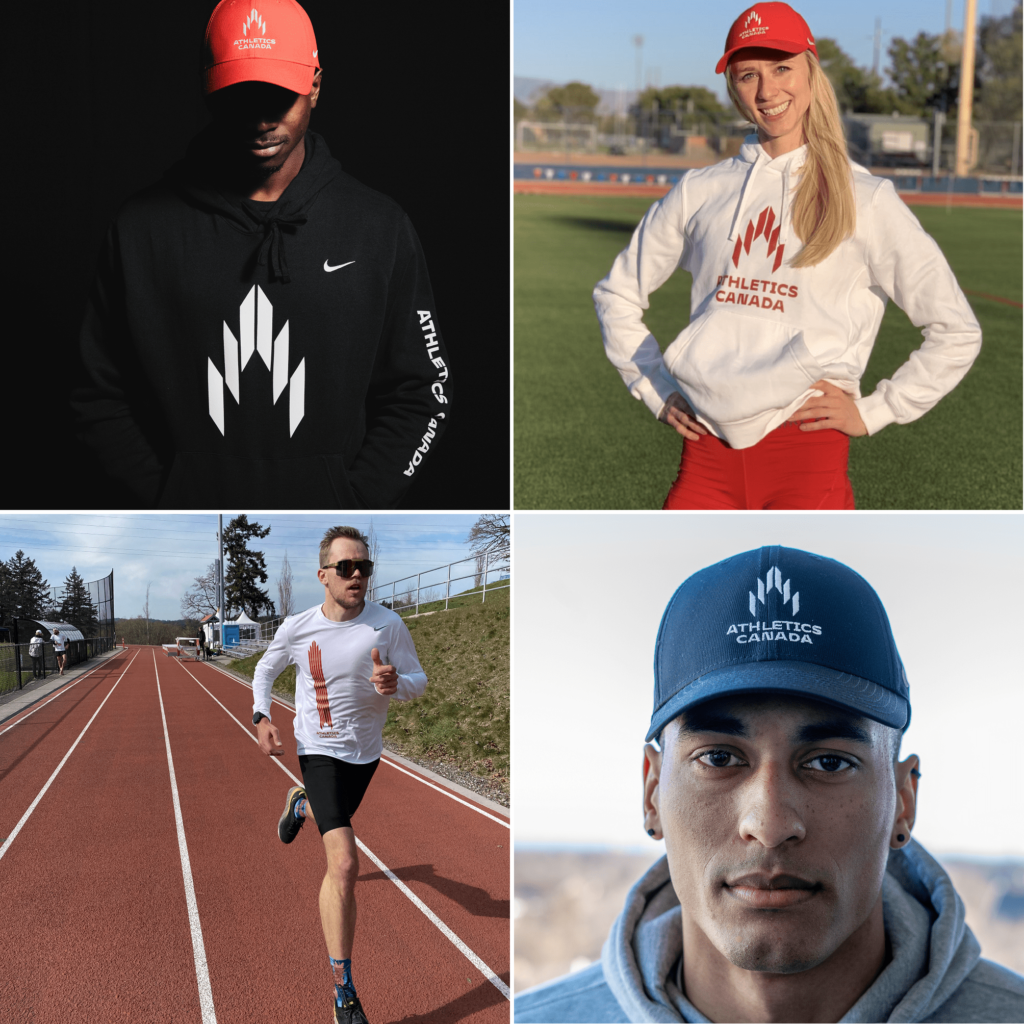
The Athletics Canada logo: Power + passion + Canada
The new logo for Athletics Canada has classic Canadian colours paired with a modern design, broken down into five distinct elements:
The Maple Leaf: First and foremost, Athletics Canada represents Canadian athletes and fans. The logo uses shapes inspired by the Maple Leaf, with the negative space in the middle of the symbol forming the top of a Maple Leaf.
The Track: Lanes from the track are represented in the shapes that form the symbol, while the angle suggests the movement and speed athletics is known for.
The Podium: The tiered shapes that make up the logo depict every athlete’s goal: the podium.
The Torch: A symbol of the pursuit of perfection, enlightenment, passion and hope, the logo is reminiscent of the glowing flames of a torch.
A for Athletics: Coming to a point at the top of the logo, the symbol with the logo reflects the shape of the letter ‘A’.
“Some of Canada’s very best athletes took the time to meet with us to help us in the strategic planning stage. The athletes and the team at Athletics Canada were fantastic partners in the collaboration of this new bold and modern brand identity,” said Scot Keith, founder and CEO/president of One Twenty Three West.
“We can’t wait to see the new brand and look on our remarkable athletes as they compete with pride for our country.”
Now that the new brand has been launched, fans can see their favourite athletes wearing it in competition or can purchase attire themselves. You can wear Athletics Canada’s new logo today, with their newly branded apparel available at shop.athletics.ca.